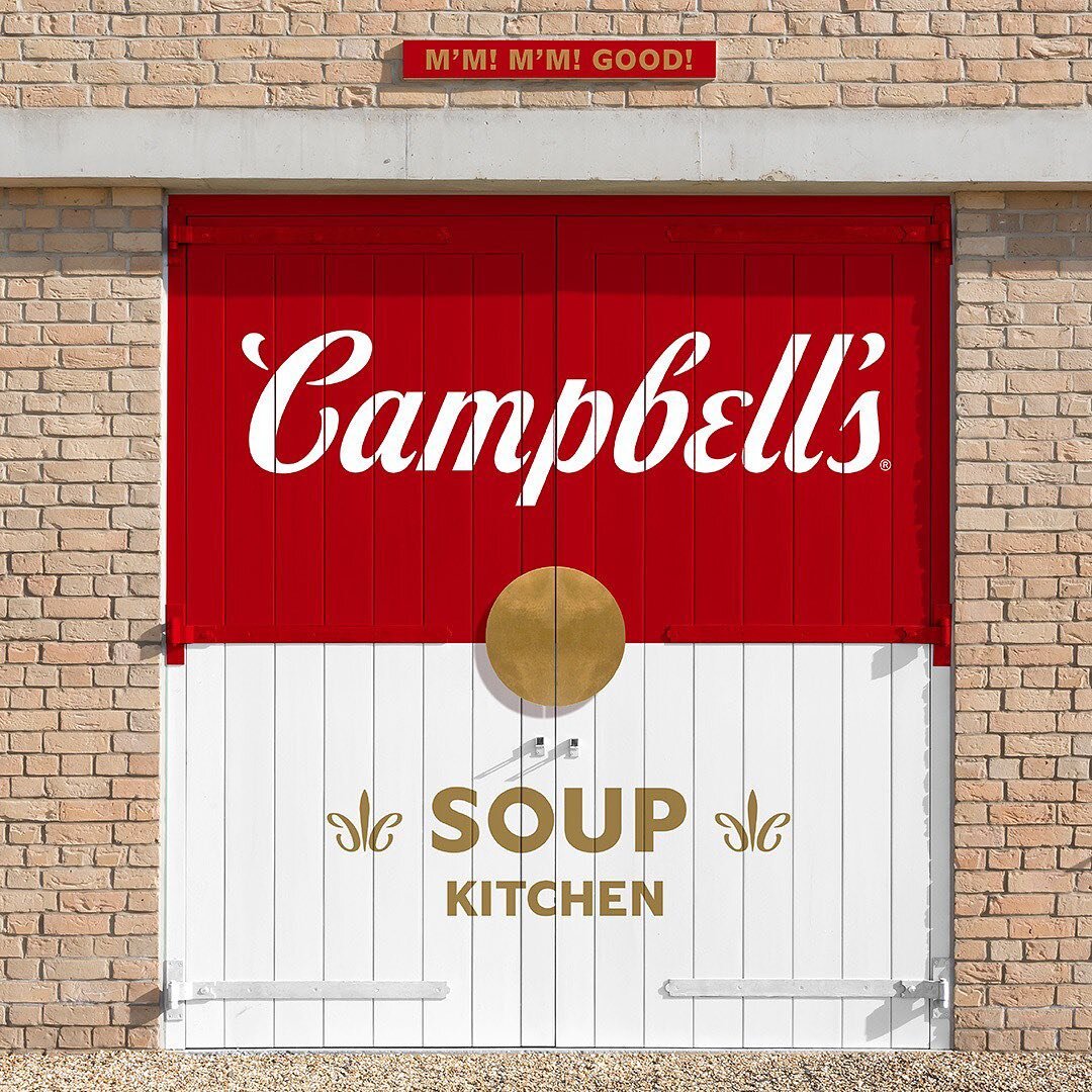
CHALLENGE: Elevate and modernize the iconic brand with a new design system to attract a younger consumer
APPROACH: Refreshing the iconic brand and building a modern design system with the original brand’s core brand essence to maintain current consumers besides new, younger consumers
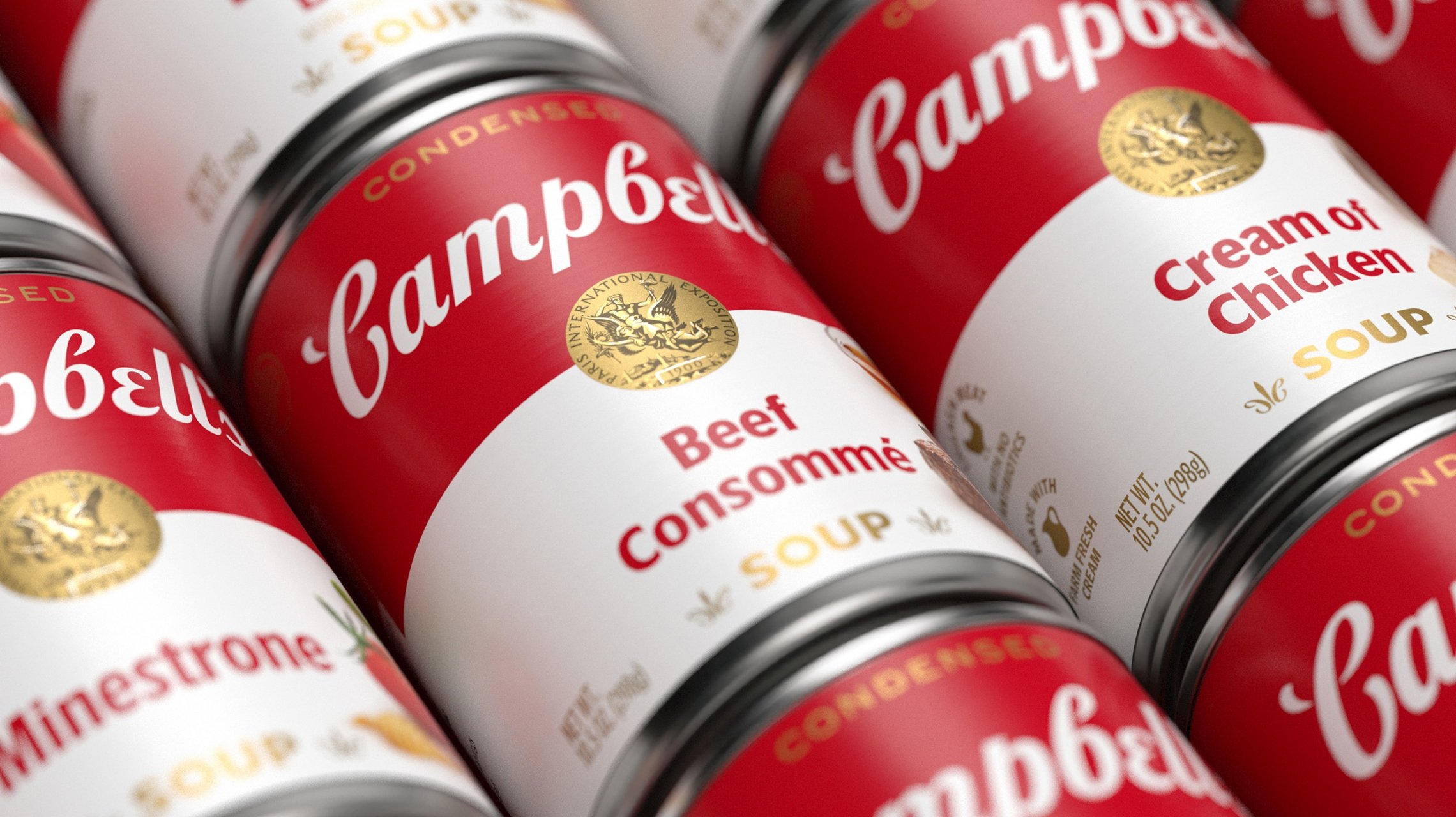
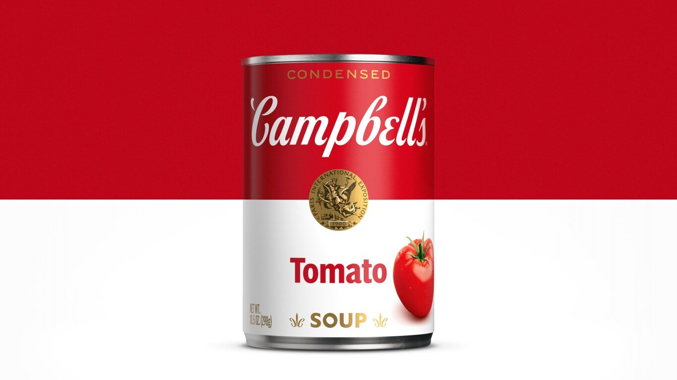
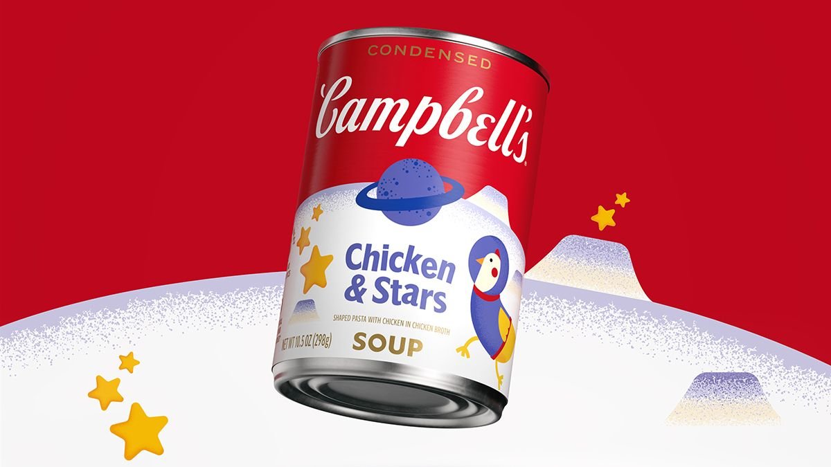
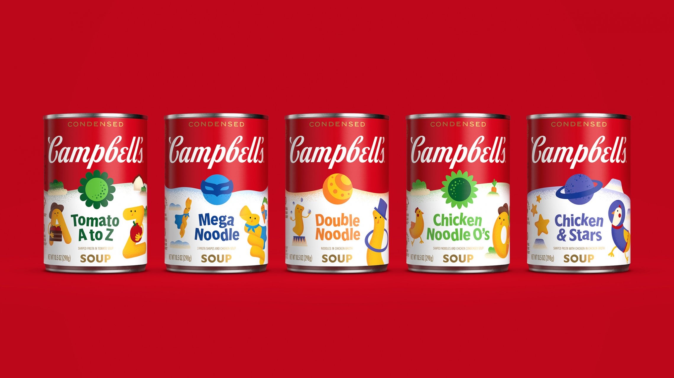
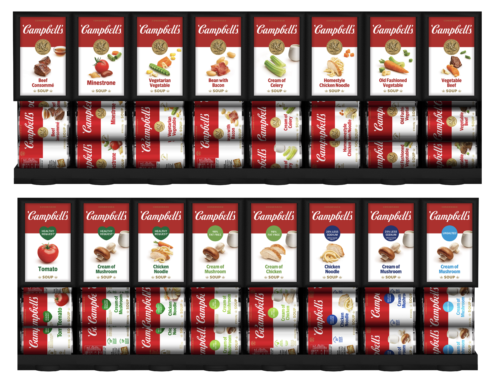
1. Simplified and modernized logo scripture, which has been carried through the years and nods to Joseph Campbell’s original signature, for all brand platforms, including digital shelf
2. Added the photography of ingredients to the label to show consumers how Campbell’s can be a meal starter and demonstrate our quality ingredients
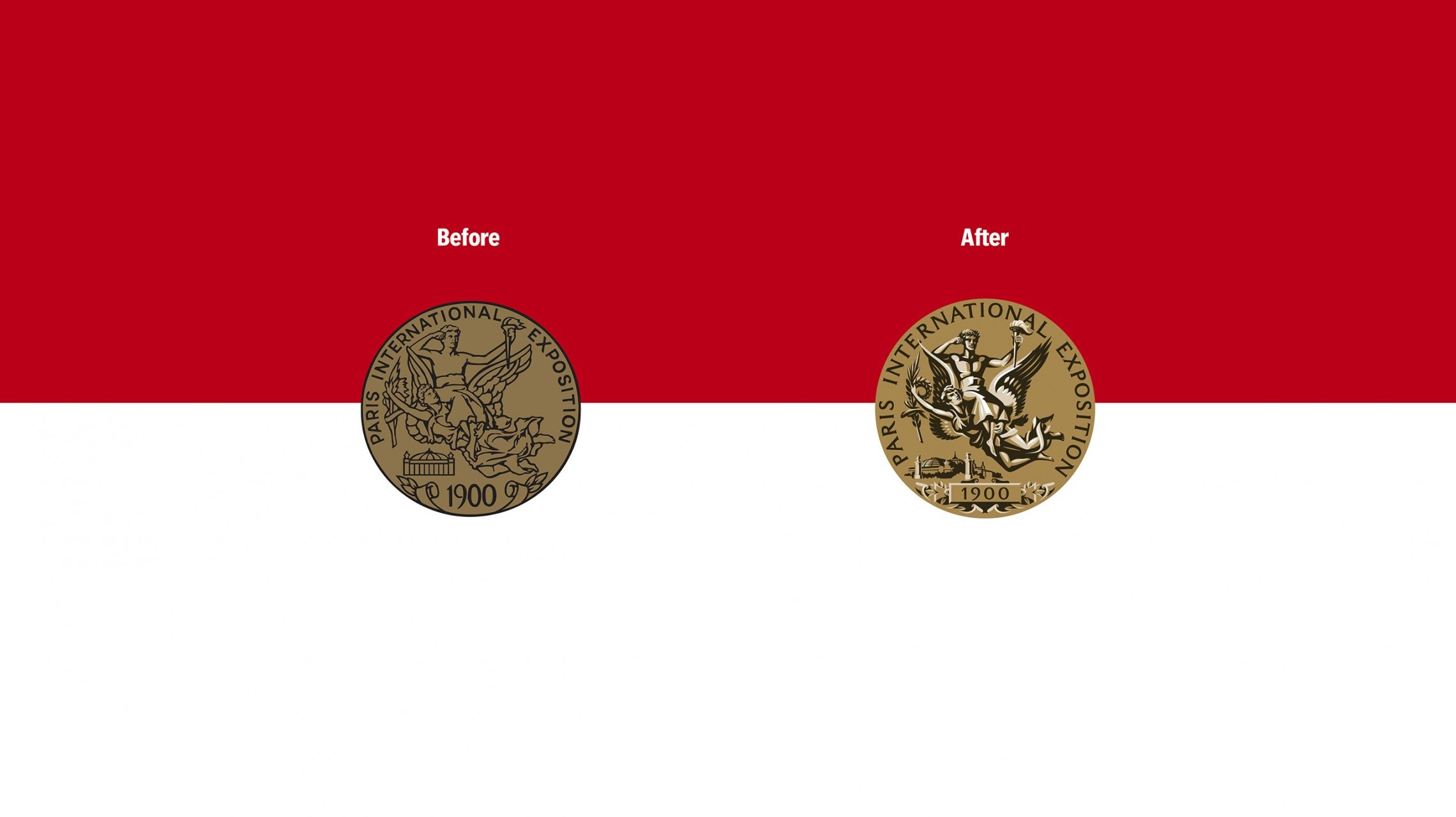
3. Modernized the signature medallion to better showoff details
4. Worked in hidden elements, including using Campbell’s “C” in the fleur de lis to add additional, subtle branding, as well as angled the “O” in Soup to pay tribute to original lettering from our 1898 label
RESULT:
• Brought in more than 8MM new Millenial households since 2019
• Gen Z volume sales increased 9.4% vs. YA.
• Gen Z & Millenials represent + 18MM in new dollar sales change since the label changes
AWARDS:
TRANSFORM NA AWARDS: Best Visual Identity / Bronze
GRAPHIS: Visual Identity / Gold Packaging Design / Silver
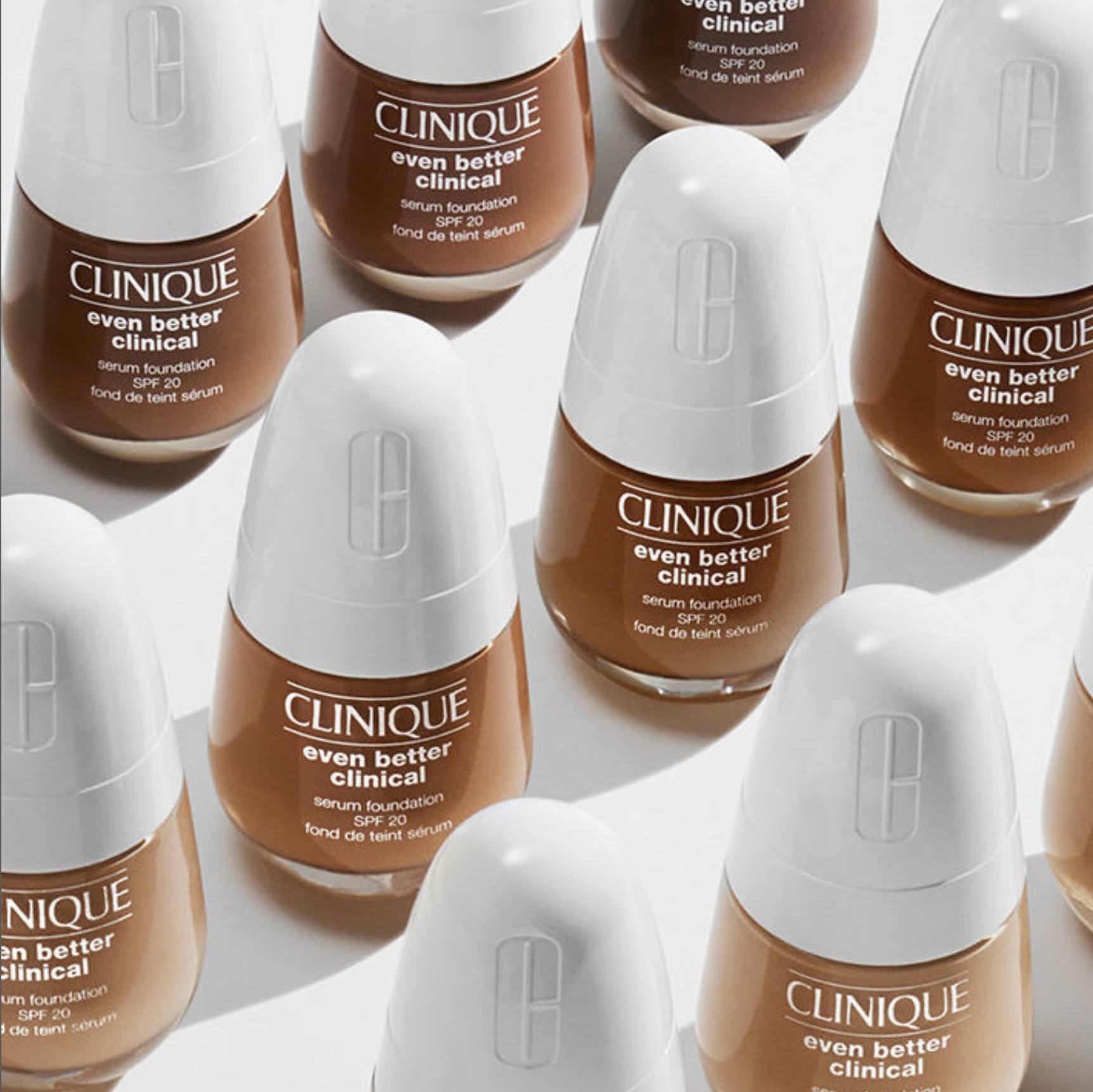
Clinique Cheek Pop limited edition for Asian market
Collaboration with Kakao for Korea / Celebrating 3 most popular Kakao characters for Millenial consumers
National flower edition / Hibiscus for Korea, Cherry Blossom for Japan, Peony for China
2020 Chinese New Year Rat
2021 Chinese New Year OX
Role: Creative direction
As the lead of global package design, I oversaw 5 categories: skincare, makeup, fragrance, holiday & promotion, travel & retail. Responsibilities included creating shelf-back, social-ready graphic designs, and package designs to help drive overall brand strategy, concepting, and ideating product designs, and leading design initiatives for in-store and online retail outlets.
Role: Design, Creative Direction
CHALLENGE: Bring taste appeal, and modernize the brand and package design. And elevate attributes of the product benefit, such as high protein and low sugar.
CONCEPT: Emphasize the nutrition info typography and an appetizing visual to convey a balance of nutrition and taste.
ROLE: Design, Creative Direction
Branding, Package Design, Web, Social Campaign.
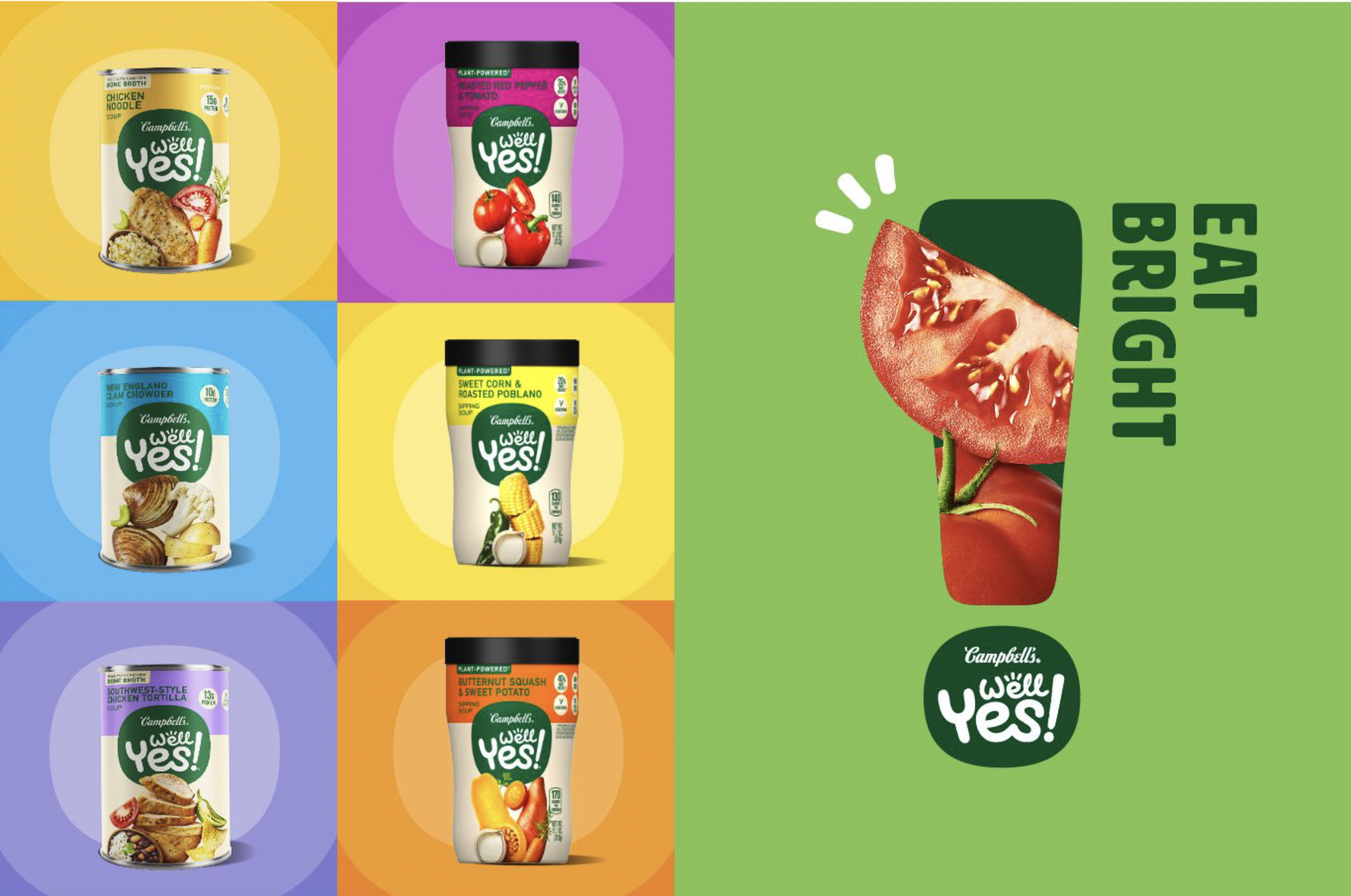
CHALLENGE: Well Yes! It continues to be lost on the shelf and is drowned out by its competitors.
IDEA: Bringing new modern Brand Identity and label design with a cohesive design system to boost shelf impact
AWARDS:
GDUSA, 2023 AMERICAN PACKAGE DESIGN WINNER
CHALLENGE: Prego is the #1 Italian Sauce in the US. However, the Italian Sauce aisle remains highly competitive, and consumers gravitate to purchasing top-of-mind and physically available brands.
SOLUTION:
– Modified the visual assets to be modern, clarified brand architecture and positioning across platforms to strengthen consumer understanding of portfolio (Core flavors, Better-For-You, Chunky Garden, Elevated Flavors)
– Made the benefit & flavor navigation easy and brought a strong brand presence on the shelf to drive relevance and taste appeal to younger consumers
DESIGN: Davis Design
ROLE: Creative Direction
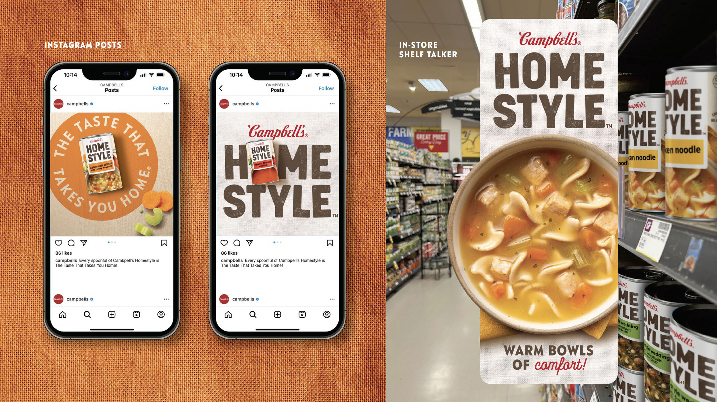
CHALLENGE: Modernize and reintrduce the Homestyle brand to be more representative of today’s Gen X homes and kitchens to drive growth
SOLUTION: New and modern identity system that boasts strong flavor navigation and photography with an irresistible appetite appeal.
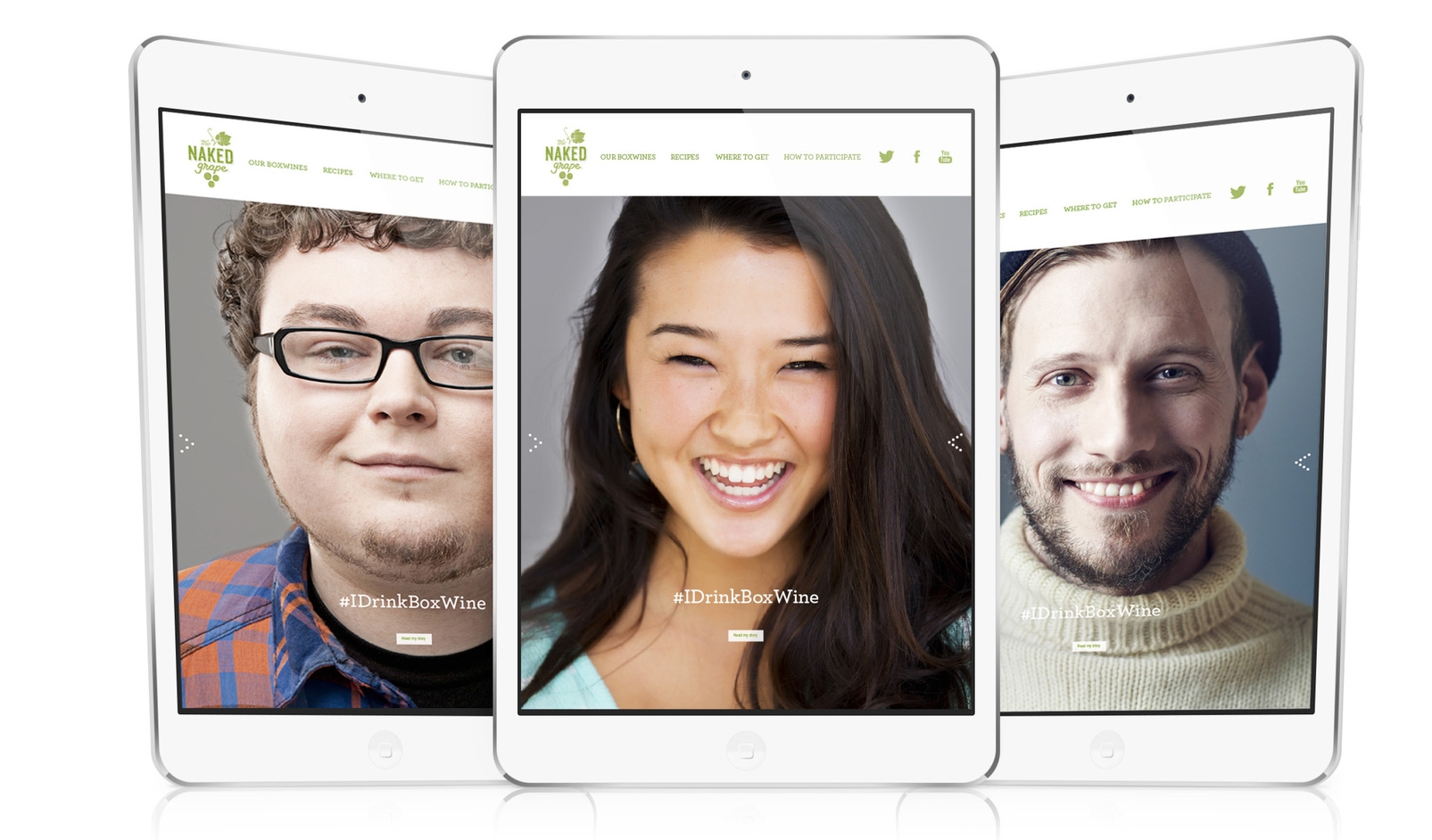
PROJECT: #IDrinkBoxWine
CHALLENGE: Nobody wants to be caught dead drinking box wine.
IDEA: Turn the stigma of box wine into a badge of honor.
ROLE: Concept, Art direction & Design, Creative Direction
COPY: Ari Krauss
Web, OOH, Social Campaigns, Print, POS
CHALLENGE: Elevate and modernize the #1 tomato juice brand with a new design system to attract a younger consumer
SOLUTION: Bring a fresh, modern visual identity and package design with great consistency for the entire portfolio
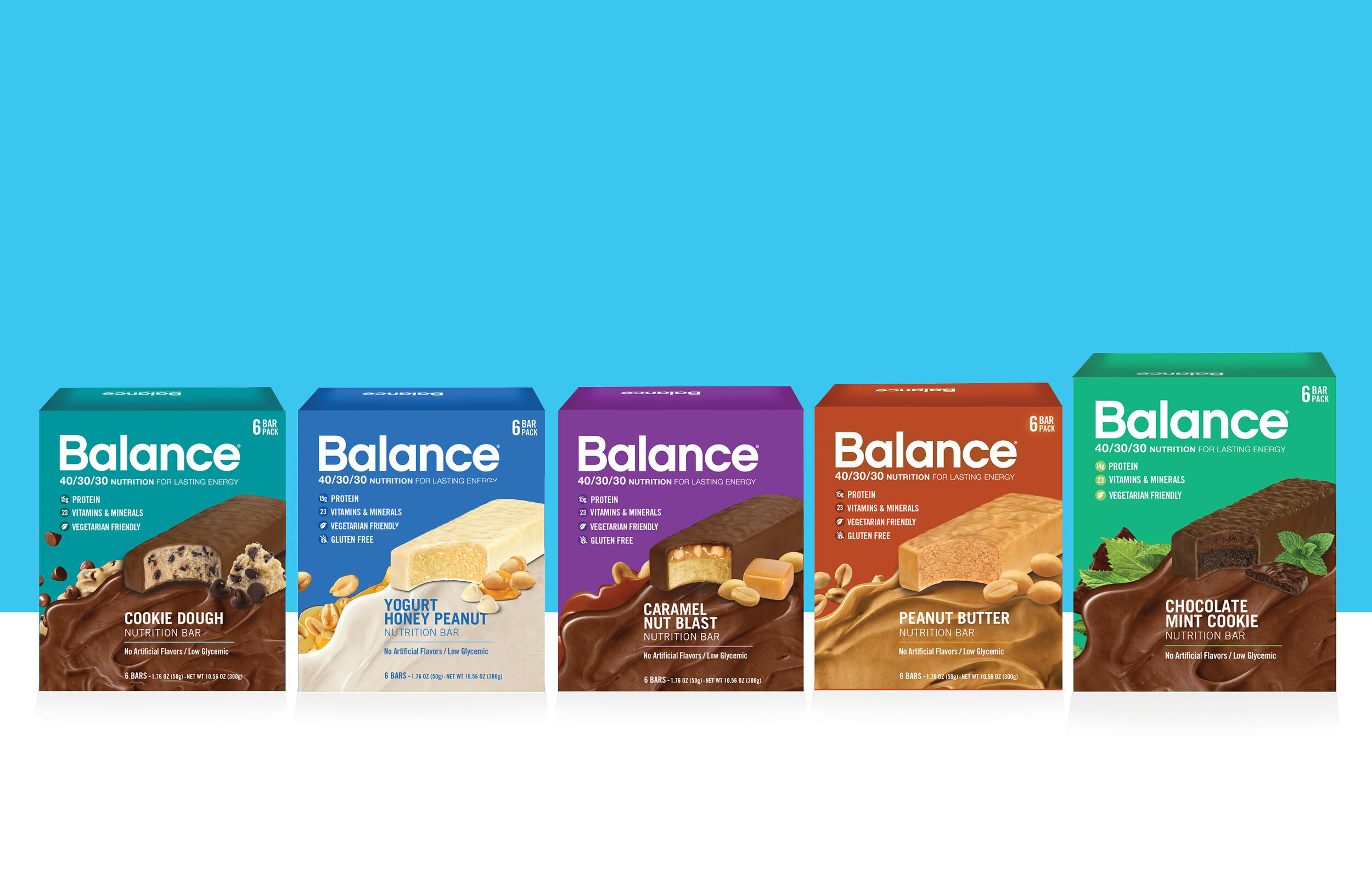
Balance Bar & Balance Bar Duo Redesign
CHALLENGE: One of the best-selling protein bars at Target, and they asked us to revamp the design and still attract loyal consumers.
ROLE: Concept, Design
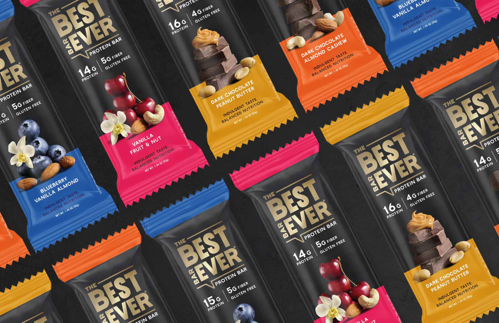
Best Bar Ever / Refrigerated Protein Bar
CHALLENGE: Refrigerated protein bar is a new category in the nutritional bar market, so bring taste appeal and also premium lux look to attract millennial consumers.
CONCEPT: To convey consumers’ feedback “The Best Bar Ever I‘ve ever tried”
ROLE: Concept, Design, Creative Direction
Branding, Package Design, Social Campaign, POS
CHALLENGE: Bring a new, fresh design to Solgar's premium vitamin line for the younger target.
ROLE: Design, Creative direction
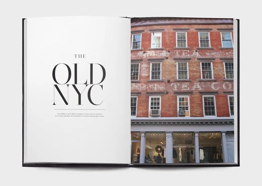
PROJECT: Document New York City's old and new street typography
IDEA: Bringing awareness of the importance of typography in design and showing how we live in a world full of great inspiration.
ROLE: Concept, Research & Copy, Design, Photography